


Design is often an afterthought among product owners, both in digital and offline product and service sectors. Misconstrued as aesthetic, design is often considered an optional luxury in the development lifecycle, isolated from and deprioritized over ‘function’. This article explores the make-or-break value that incorporating good design can bring to developing products and services of quality that resonate with the user base, as well as the fundamental organizational changes that can be made to achieve this.
Introduction
When was the last time you climbed a flight of stairs? Did you find yourself uttering a silent prayer before embarking on the first step, or breathing a sigh of relief after having made it to the other side? Unless you fall into the (actually considerably sized) user groups for whom stairs are a challenge, the answer is probably not. And yet stairs are one of the most dangerous entities we come into regular contact with in our daily lives. As stated in [Brys10], stairs “rank as the second most common cause of accidental death.” The cause of accidents on stairs also depends on several factors, a large number of which boil down to design, such as “poor lighting, absence of handrails, confusing patterns on the treads, risers that are unusually high or low” [Brys10] lists. This might seem like inflating of the problem until we look at the effect of a small design change, as in [Temp95]: “… the stair edges had been given a non-slip covering with a pattern that made it difficult to discern the stair edge. In six weeks, more than fourteen hundred people – a truly astonishing number – fell down these stairs, at which point the problem was fixed.” And yet we never fully acknowledge the number of design factors that must come together in exactly the right way for us to make our journey between elevations without incident. This is because fundamentally, good design is often invisible. According to [Spool08]: “Good design, when it’s done well, becomes invisible. It’s only when it’s done poorly that we notice it.”
A customer does not go to a product to appreciate it, they use it in order to perform their task at hand. If the design and usability is poor, it becomes noticeable and the user is diverted from their object. In a world with increasing choice (especially in the fast-moving world of software and technology), the inability to clearly display value and usability to the customer effectively means they’ll be lost. And if the product owner is unable or unwilling to respond to those pain points, their competitors will. Any and each of which could eventually mean that the product has failed.
This article will take a look at some of the common misconceptions about the definition of design, the pitfalls in how design capabilities are incorporated (or not) in projects, the benefits of well implemented design at a business level, what constitutes ‘good design’, and lastly how to implement design in your business at an organizational level to take advantage of the value of good design.
Common pitfalls in design management for software development
Just as with any product or service, digital product owners are aware that ‘quality’ is an important element of software development. However, many forget entirely to include the aspect of usability in the definition of Software Quality.
Unfortunately, many product owners, especially at a corporate and enterprise level, have the impression that design only entails the look and feel, to be applied on top of a nearly finished product. This approach will rarely, if ever, disguise the fundamental flaws in the usability of the product in the end. As stated by [Veen00]: “I’ve been amazed at how often those outside the discipline of design assume that what designers do is decoration – likely because so much bad design simply is decoration. Good design is not. Good design is problem solving.”
The mentality to stick some ‘design’ on towards the end of a product development lifecycle, while misguided in execution, still acknowledges the need for some level of decent customer experience. Amongst producers of Enterprise Systems however, often the feeling is that since the user has no choice but to use the system prescribed to them by management (and as such, the user is not the customer), user experience is not an important factor in the development of the product.
Time and again the narrative in the context of enterprise development is that there is not a budget for design: “It does not need to look nice; it just needs to work.” Aside from the fact that according to [FORR08] 70% of project failures is due to lack of user acceptance, the question that mindset raises is: how would you define that ‘it works’? If the software complies with all functional requirements, but these requirements were drawn up based on flawed or un-validated premises to begin with, if it is bug-free and well-integrated, but the user can’t effectively find any of the information they’re looking for or perform the tasks they need to, can it still be said that ‘it works’? Can it still be said that it is a quality product? Most likely not, and yet time and again, these are exactly the choices that product owners are unwittingly making when they choose to de-prioritize both the time and budget for design, in the product development lifecycle.
Even when it is true that the user has no option but to use the prescribed system, the frustration and lack of usability can often lead to costly human errors. In 2018 the whole world learned of the panic caused in Hawaii by a message warning of impending missile threat, which eventually turned out to be a false alarm caused by an employee pushing the wrong button. Fewer people are aware of later reports that revealed the poor interface design that led to this human error. As reported by [BINL18]: “A newly released photograph of the emergency alert operators use to issue state wide alarms shows a confusing interface that relies on technical language, unclear shorthand, and a variety of single-color links for everything from county amber alerts to statewide tsunami warnings that look incredibly similar to one another.”
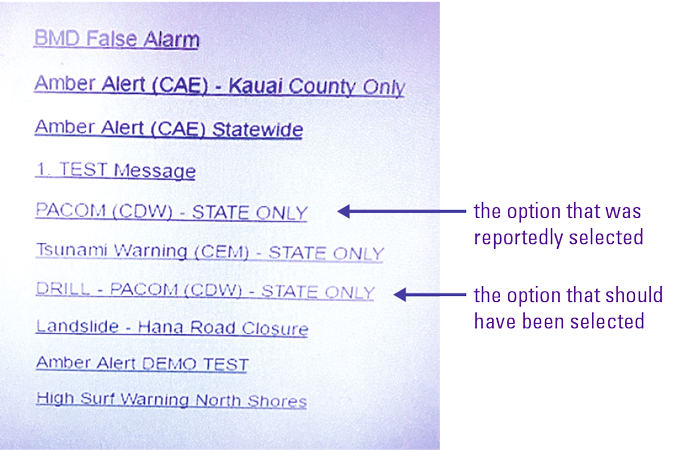
Figure 1. The screen that the operator who issued the false alarm would have seen. Screenshot via Twitter: @CivilBeat. [Click on the image for a larger image]
While it is easy to blame the operator for making the mistake, one look at the system he had to use clearly shows a complete lack of UI/UX (User Interface and User Experience) Design investment during the development phase. Cutting corners on usability came at the cost of damage control and embarrassment for the Government of Hawaii.
Product owners often don’t understand the value of the ‘invisible’ design that should be intrinsic to the fabric and very structure of the product – seeing design instead as decoration alone and therefore a ‘frivolous’ cost that can be cut – often eventually leading to more irrevocable consequences.
Good design is invisible
What happens in many of these critical UX failures comes from a lack of knowledge on the project management or business side of how much happens ‘beneath the surface’ of a great software product design. Due the to ‘invisible’ nature of such a large part of design activities, most people limit their concept of design to aesthetic or visual. As mentioned earlier in this article, this translates into having a ‘pretty’ GUI (Graphic User Interface) in a software context. But so much of what makes a product usable, and even relevant, is created ‘behind the scenes’ by the designer.
Based on the elements of User Experience as detailed in [Garr08], the Iceberg Model of UX shows the reality of how much happens backstage when design is correctly applied in the User Experience design of Software Development.
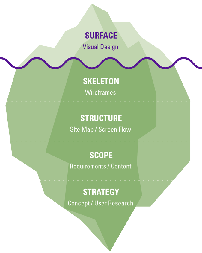
Figure 2. The Five Levels of User Experience Process. [Click on the image for a larger image]
At the very base of the iceberg, the foundation of all design, is empathy for the users. Often achieved by designers through user research, immersive observation and persona development, this drives all other forms of design activity – from developing the concept and product strategy, to validating the requirements, building the structure and skeleton – all while validating and testing with the users. A good designer in this method is often the bridge between the business and the users.
There is a reason why Design Thinking is named as such: it is developed for businesses and entails a codification of the human-centric approach that is intrinsic to a good designer’s creative process. As explained by Tim Brown, CEO of IDEO, one of the first companies to showcase the design thinking process: “Design thinking is a human-centered approach to innovation that draws from the designer’s toolkit to integrate the needs of people, the possibilities of technology, and the requirements for business success.”
While so many design activities are invisible in the end product, the flip-side is the invisible nature of good design when these are executed well. Briefly mentioned in the introduction of this article, [Spool08] uses the example of air conditioning in a room to illustrate that if a room is too hot or too cold, the air conditioning unit is noisy or dripping, which causes irritation. However, when the conditions are ‘right’, it is no longer noticed, and the user focuses on the task at hand.
Another example to illustrate the psychology of visible-when-poor is in the motivation behind online reviews. While few of us bother to leave a review every time we eat out, the minute we’re faced with a sub-par situation, we’re suddenly aware of our ‘power to review’. An awareness of this mentality is as relevant for the producer of software as it is for the restaurant owner – after all, what we’re creating is still for humans to experience.
Good design creates delight to differentiate
Tools like the Kano model, developed by Professor Noriako Kano in the 1980s [Kano84], are still used by designers to map both what customers want as well as possible product pitfalls that could create user backlash. The model surfaces the potential elements of an experience that only becomes visible to the user when poorly executed (often referred to as Hygiene factor). These are your product must-haves, imperative to market entry. While you can see the value of this information right at a product strategy level, designers use this knowledge to design-out potential problems in systems.
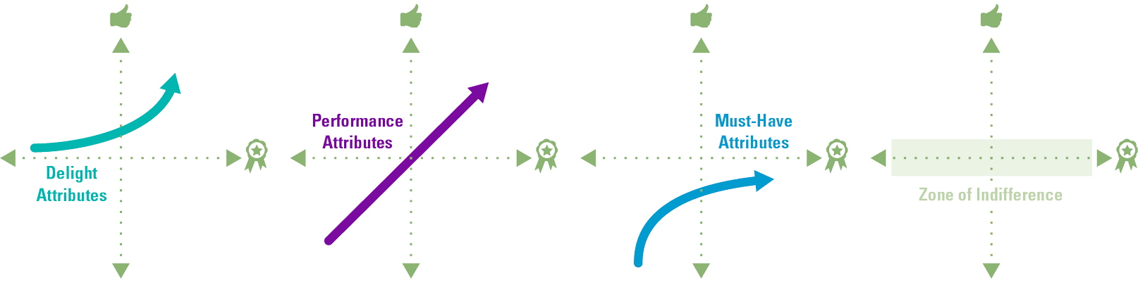
Figure 3. The basics of the Kano model [Kano84] – an important tool to organize product design and development priorities. [Click on the image for a larger image]
Of course, design is not just about problem solving, but also about creating delight. By mapping customer feedback on the satisfaction received from product features, against the level of execution of the features themselves, the Kano model helps product teams understand not only which features are ‘must-haves’, but also the ones that are either performant factors – i.e. considered standard expectations – as well as the ‘nice-to-haves’. Also known as ‘delight factors’, the latter are the opportunities for innovation and creating customer loyalty by design. In a time of high market competition, creating this delight could be the key differentiator that makes or breaks your product.
Time is also a factor – the features that were delightful differentiators in the past get co-opted by competitors, rendering them tomorrow’s must-haves. As explained by [Moor06]: “Technologies from a prior era, once the focal point of innovation, now become the scaffolding upon which next-generation innovation will build.” Ensuring lasting product or service quality means innovation is not a one-time activity, but a continuous and iterative process.

Figure 4. The Kano model [Kano84] detailed version. [Click on the image for a larger image]
Integrating customer research not only allows the designer informed decisions, but is vital to allow prioritization and product functionality decisions across the product development team. One of the most important tools in a designer’s arsenal is not the graphics program or the wireframing software they use, but the ethnographic and environment research that allows them an understanding and empathy for the users. A good designer that has gained an understanding of the customer wants through immersive ethnographic research should be used as the representative of the users and customers that could provide invaluable insight throughout the product development process.
Eventually, user involvement through design thinking processes can vastly improve decision making. This, together with the informed prioritization, could help vastly cut product development time as well. Getting the most out of your design team and design as a function, could eventually elevate the effectiveness of all other functions in the software development team.
Measuring the value of good design
While the benefits of design were previously considered to be abstract and conceptual, effort has been put into measuring the business value of design in recent years.
The Design Management Institute has created Design Value Index, a partnership with Motiv Strategies and funded by Microsoft, to analyze the performance of US based companies that have committed to integrating design with their business strategy. The 2015 index [DMI16] plotted results over the previous ten years to show that design led companies demonstrated returns yielding 2.11 times that of the S&P 500.

Figure 5. Adapted from Design Value Index 2005 – 2015, The Design Management Institute [DMI16]. [Click on the image for a larger image]
McKinsey further developed the Value of Design Index into the McKinsey Design Index (MDI), which analyzed and rated how good companies were at design and mapped that against financial performances. Over five years, and across multiple countries and industries, they tracked the design practices of over 300 publicly listed companies. The results of the report [MCKI18], published in October 2018, revealed some broad themes.
1. There was a strong correlation between high MDI scores and better business performance. According to [MCKI18]: “Top-quartile MDI scorers increased their revenues and total returns to shareholders (TRS) substantially faster than their industry counterparts did over a five-year period – 32 percentage points higher revenue growth and 56 percentage points higher TRS growth for the period as a whole.”
2. The results were consistent across all three industries studied, namely medical technology, consumer goods and retail banking. This suggested that the effects of design were relevant across physical and digital products, services or combination.
3. TRS and revenue differences between the second, third and bottom quartiles were marginal, indicating that the top quartile companies stood out from the crowd and were rewarded disproportionately so.
What we learn here is that, aside from the other characteristics of the value of design discussed through this article – customer experience and therefore retention, informing product strategy and relevance and reducing development time, i.e. increasing the effectiveness of the entire software development function – it also has measurable business impact.
Getting the most from design for your organization
[MCKI18] reports: “The potential for design-driven growth is enormous in both product and service-based sectors.” But the study also shows that up to 40% of companies are still not involving input from their end users during development, over 50% don’t know how to objectively set targets for their design output and therefore are reluctant to allocate resources to design functions. This is unfortunate, as the driver for change requires company-level investment and decision power.
The question is: what needs to happen at management level to drive change through the power of design?
[MCKI18] also surfaced the four areas within which the top quartile companies in design (that were also the leading financial performers) excelled:
- Analytical Leadership – The top performing companies counted design amongst the top management issues and tracked design performance with the same rigor as revenues and costs.
- Cross Functional Talent – Breaking down silos to incorporate designers and make user centric design a responsibility across departments created important culture change.
- Continuous Iteration – The environments where design best flourished are the ones that enabled an approach that incorporates learning, testing and iterating with users. This is in direct contrast to the older waterfall model, and continuing the iteration post launch by maintaining the feedback loop.
- User Experience – In a world of the internet of things and continuous feedback through social media the best performers break down the barriers between product and service silos to focus more on delivering the customer a seamless experience.
All in all, effective execution of design and Design Thinking requires a culture that enables both the safety to fail (if failing fast and cheap) to enable creativity and experimentation, as well as enabling and empowering to succeed. This means embracing a Design Thinking mindset at an organizational level.
As stated by [Brow09]: “To harvest the power of design thinking, individuals, teams, and whole organizations have to cultivate optimism.”
Integrating the design team early on into the product development process is essential to achieving a structurally well-designed product or service. Creating change through a product or service of superior quality is not something that can happen in a sequestered design department, but by integrating design capabilities at an organizational level. And by empowering design within the organization, the hope is that design in turn elevates the impact and efficiency of the whole organization.
References
[BINL18] M. Kranz, Here’s the incomprehensible screen that led Hawaii to send a terrifying missile alert by mistake, Business Insider Nederland, https://www.businessinsider.nl/screen-that-set-off-hawaii-false-missile-alert-2018-1/?international=true&r=US, 2018/01.
[Brow09] T. Brown, Change by Design: How Design Thinking Transforms Organizations and Inspires Innovation, Harper Business, 2009/09.
[Brys10] B. Bryson, At Home: A Short History of Private Life, Doubleday, 2010/10.
[DMI16] J. Rae, 2015 DMI: Design Value Index Results, Design Management Institute in Conjunction with Motiv Strategies, https://www.dmi.org/page/DesignValue/The-Value-of-Design-.htm, 2016/12.
[FORR08] R. Rogowski, K. Bodine and S. Geller, Rich Internet Application Errors to Avoid, Forrester Report, 2008/06.
[Garr08] J.J. Garrett, The Elements of User Experience: User-Centered Design for the Web and Beyond, New Riders, 2002/10.
[Kano84] N. Kano, S. Nobuhiku, F. Takahashi and S.Tsuji, Attractive quality and must-be quality, Journal of the Japanese Society for Quality Control, 1984/04.
[MCKI18] B. Sheppard, H. Sarrazin, G. Kouyoumjian and F. Dore, The Business Value of Design, McKinsey Quarterly, 2018/10.
[Moor06] G.A. Moore, Crossing the Chasm: Marketing and Selling High-Tech Products to Mainstream Customers, Harper Business, 2006/07.
[Spool08] J. Spool, UIE Tips Introduction to Article Communicate Quick – First Impressions Through Visual Web Design, UIE, www.uie.com, 2008/10.
[Temp95] J. Templer, The Staircase: Studies of Hazards, Falls, and Safer Design, The MIT Press, 1995/03.
[Veen00] J. Veen, The Art & Science of Web Design, New Riders Press, 2000/12.